Thursday, March 30, 2017

Week 9B

In Class

In class, our final edited website is due for a grade. All edits must be completed and it must be turned in. Here is what our site looks like:


I put these together in Photoshop, so it looks more like the mobile version of the site.
Here's screenshots of what it would look like on desktop:

Home Page:


Evaluating Typefaces Page: 


Typographic Systems Page: 


Composition Page: 


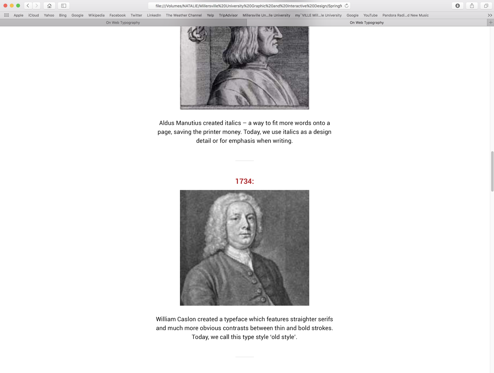
And Lastly, the History Page: 


Tuesday, March 28, 2017

Week 9A

In Class

In class, our final website was due. We presented our sites to the class and received feedback. Our website did not have any images on the other pages, so we needed to add some. Also, some sections in Chapter 5 and Chapter 6 needed to be fixed.

We had the remainder of class to work on editing our group websites and working on our manifestos and our own typefaces.

On Thursday, March 30th, 2017, we will be turning in our final websites for a grade.

Thursday, March 23, 2017

Week 8B

In Class

Nancy was at a conference, so we were supposed to meet with our groups to work on our site. My teammates gathered up some images and shared their content with me so I could correctly put it on our website. Here's what our site looks like:

Home Page


Bottom and Footer


The site is due on Tuesday, March 28th, 2017. I am working on putting the other pages content together and it will be finished by then.

Tuesday, March 21, 2017

Week 8A

Today is the day that we return back to Typography 2 after Spring Break.

Important things to note:

  • Our Group Web Projects are due on March 28th, 2017
  • Our Font is due in Fontographer on April 4th, 2017 (first critique)
  • We are being introduced to our next project...


Write Your Own Manifesto


Typographic and design history is littered with ideological stances, manifestos and occasional egotistical posturing. There are countless individuals, schools of thought and technologies that have brought us to where we are today. Some of these clearly remain fundamental to the on-going development of our discipline. Others, whilst important at the time, never made it past the 20th century. We’ve moved from Gutenberg to the Renaissance, on through the Arts & Crafts, into Modernism, Postmodernism and even Post Postmodernism. We’ve had The First Principles and The New Typography, The New Discourse, The Cult of the Ugly, Hot Metal, Books, Tablets, Clouds and beyond.

Brief
So, here we are; now, right now as you read this word; with more history and perspectives than we know what to do with. You are tasked with writing your own Manifesto that captures what you believe are the building blocks of typographic practice today. Consider both what you say, and how you say it. Your ideas need to communicate clearly – being mindful of your design-literate audience (professionals and students), but you also need to remain true to your own typographic beliefs. Typographic integrity and control should be central to your proposal.

Most manifestos are intended to rattle a few cages, but the ones that have stood the test of time tend to be grounded in solid principles, insights & theory. Your project should challenge and provoke, whilst being rooted in a clear understanding of our history. You show us; where is here?

Research & Development
It is expect deep sketches, research with evidence of your personal responses to the information that you uncover.

I would like to see lots of potential directions explored in order to get a sense of your thinking processes and understand how you come to decisions regarding the final outcome.

Your blog posts should be a reflection of your design thinking. They should be colourful, vibrant and organic – full of visual references; notations; sketches; exploration of materials and ideas.

They should not be pinterest’s  or dissertations and they should not be ‘retrospective’ i.e. ‘Now I’ve finished the piece – time to fill the sketchbooks with photocopies’.

Target Market Type designers, typographers, graphic designers, educators students, craft enthusiasts, and discerning members of the public.

Submission Guidance/Requirements Your project submission should include sufficient appropriate material to show that you have addressed the brief comprehensively and clearly expressed your design and typographic skills.

It must include:
• Strategy
• Research and design development
• Specifications/Grid(s)
• Final outcomes
• Blog recording project development along with presentation images of your project(s)

A non-print project that is portfolio worthy
This can be a website
Projection
Motion Graphic

Thursday, March 9, 2017

Week 7B

In Class

In class, we were introduced to www.webydo.com. Our groups can create a website on that site or on WordPress. I also believe you can hand-code your site.

Since my group is not here today, I decided to do a little experimenting on my own.
Before I did this, though, I finished my web exercises and uploaded them to the correct files.

Webydo


I decided to check out inspiration, to get my creative mind going. 


I chose the Travelwide website. 


Ok, this is cool as hell. Here is a little experimentation from me:


And more:


This is fun and easy. 


Maybe our team will use this? I already like it. Maybe they will too. This is just experimenting, playing around with a new program. It's not a final layout. I am going to discuss that with my group before anything else.


Tuesday, March 7, 2017

Week 7A

Before Class

Before class, I decided to work on my Web Projects. I finally got 2 different fonts to work on my bibliography using Google Fonts.


The font I used for the headings is Clicker Script and for the body I used Quicksand

During class, our groups did presentations on our website. Then, we worked further on our website team project. 

Thursday, March 2, 2017

Week 6B

I finished my typeface and made it into an Open Type Font.

Obviously I still need to do some editing with the lowercase letters. But I am very pleased with the capital letters.

Here it is typed in Illustrator:


The lowercase letters need some work. I'm still pleased with how the capital letters came out.